


You can have the store live, the products uploaded, the theme polished, and still feel stuck the first time real shoppers land. Traffic comes in, a few people browse, and then the numbers flatten because the site looks like a clothing brand but behaves like a generic catalog. That gap is where most Shopify apparel stores lose money, and it's usually not one big mistake, it's a stack of small ones across product data, fit confidence, performance, and checkout.
Why a Shopify Clothing Website Needs a Different Playbook
A founder can have the theme installed, the first collection live, and still lose shoppers the moment real traffic arrives. Clothing buyers ask different questions than many other customers. They want to know how something fits, how it feels, how it drapes, whether the color matches the photos, and what happens if it does not work out.
A Shopify clothing website also has a harsher traffic pattern than many other storefronts. Shopify reported that its infrastructure handled a peak of 967,000 requests per second during the 2023 Black Friday-Cyber Monday weekend, which is a useful reminder that apparel brands need a site built for spikes in attention and demand, especially around holiday and promotional periods when volume concentrates fast. Shopify's Black Friday-Cyber Monday filing
Practical rule: If your launch plan ignores holiday traffic, mobile browsing, and returns from day one, what you have is a temporary landing page wearing a clothing store's logo.
The other issue is operational. Fashion demand is seasonal and messy. A clothing brand can look healthy in a quiet month and then struggle under promotional traffic, inventory gaps, or a clunky checkout flow when the buying window opens. The right foundation matters more than the homepage hero. For a useful look at platform trade-offs, the Shopify vs WordPress NZ comparison is a solid starting point.
Choosing Between Premium Themes and Custom Shopify Development
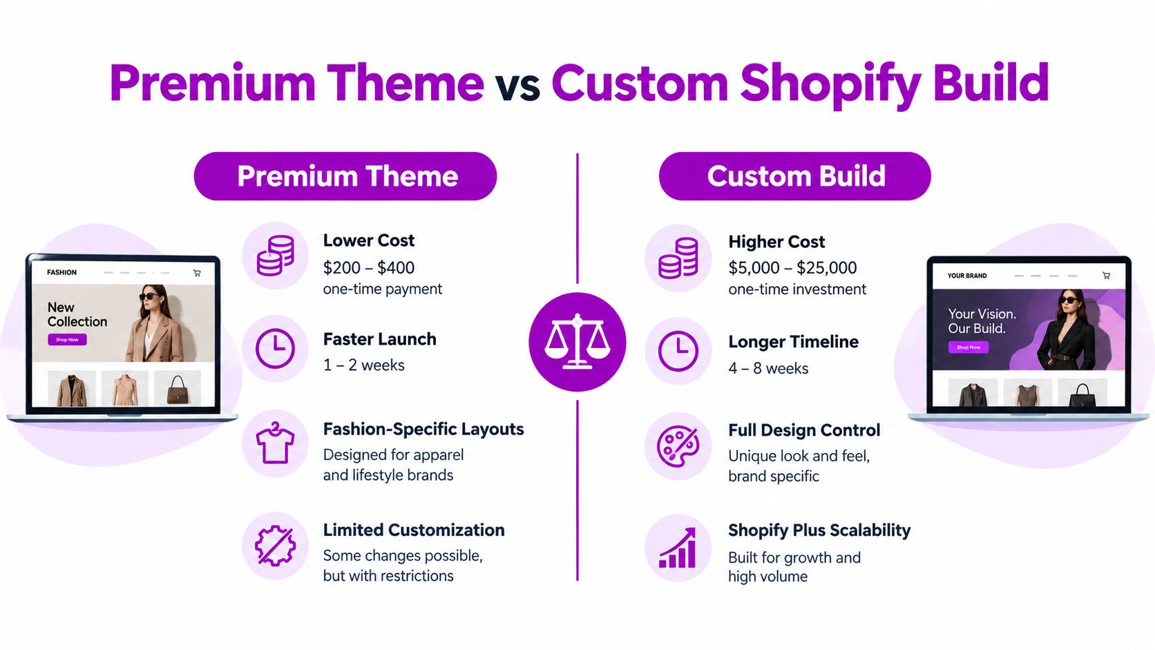
The right build path depends less on taste and more on catalog complexity. A premium theme can absolutely work for a clothing brand, but only if the catalog is fairly simple, the merchandising needs are standard, and the brand can live inside the theme's layout logic without fighting it every week. A custom build makes sense when the storefront itself needs to behave like a sales tool, not just a container for products.
For apparel, the features that matter most are rarely the flashy ones. They're the practical ones, like swatches, lookbook sections, mega menus, size guides, quick view, and predictive search. Premium themes often cover the basics well enough, but once you need unusual collection logic, richer storytelling, or a tighter fit between merchandising and UX, the theme starts to feel like a compromise.
A useful way to compare the two paths is to look at decision criteria, not just budget.
| Criterion | Premium Theme | Custom Build |
|---|---|---|
| Launch speed | Faster to launch | Slower, more planned |
| Visual control | Limited by theme structure | Full design control |
| Apparel merchandising | Strong for standard needs | Strong for complex needs |
| Fit for seasonal drops | Good for simpler calendars | Better for frequent launches |
| Long-term flexibility | Can get restrictive | Built to evolve |
The trap is assuming custom development is only for giant brands. In practice, it's a fit question. A brand with one collection and tight runway should start with a strong theme and customize surgically. A brand with large SKU counts, frequent drops, or mixed wholesale and retail operations should invest in a custom foundation earlier, because painful migrations usually cost more than doing it properly the first time.
If you're also deciding what your physical and digital launch needs look like together, Sambapay's shop opening checklist is a useful reference point for the operational side of opening a store.
Setting Up Products the Way Merchandisers Actually Use Them
Product setup is where many shopify clothing website projects go wrong. Teams upload items fast, but they don't build the catalog in a way that merchandising, search, filtering, or recommendations can use later. That creates a store that looks organized on the front end and chaotic everywhere else.

The cleanest structure starts with consistent option naming. Use Size, Color, and Fit the same way across the entire catalog, not as whatever the merchandiser happened to type that day. That consistency pays off later in filters, feeds, search logic, and internal reporting, and it makes the store easier for shoppers to scan without learning a new pattern on every product page.
A stronger setup also separates presentation from product data. Lifestyle images sell the feeling, flat-lays clarify the garment, and the metadata powers everything behind the scenes. That's where metafields come in. Add fit notes, garment measurements, model height, worn size, and fabric details in structured fields, then make sure those fields populate the right spots on the page.
Clean product data is a growth asset. If you get the catalog wrong, every downstream tool has to work harder to compensate.
Avoid stuffing every variation into a single messy SKU pattern if it makes filtering and reporting harder. The goal is not just to publish products, it's to create a catalog merchants can use. If you're moving from spreadsheets or an older stack, keep your migration disciplined and protect your URL equity with redirects. The internal reference at product information management is worth a look if your assortment is getting hard to maintain by hand.
A simple launch checklist helps keep it tight:
- Standardize naming: Keep option names and collection labels consistent.
- Match image ratios: Don't let product pages feel uneven.
- Write alt text deliberately: Describe the item, not the marketing mood.
- Store fit notes in metafields: Keep them reusable across templates.
- Redirect old URLs: Preserve rankings and avoid dead ends.
Building Fit Confidence and Returns UX Into the Funnel
Fit uncertainty is not a sizing sidebar issue. It's a conversion problem, a margin problem, and a customer-experience problem all at once. If shoppers don't trust the fit, they hesitate, they abandon, or they buy multiple sizes and send some back.
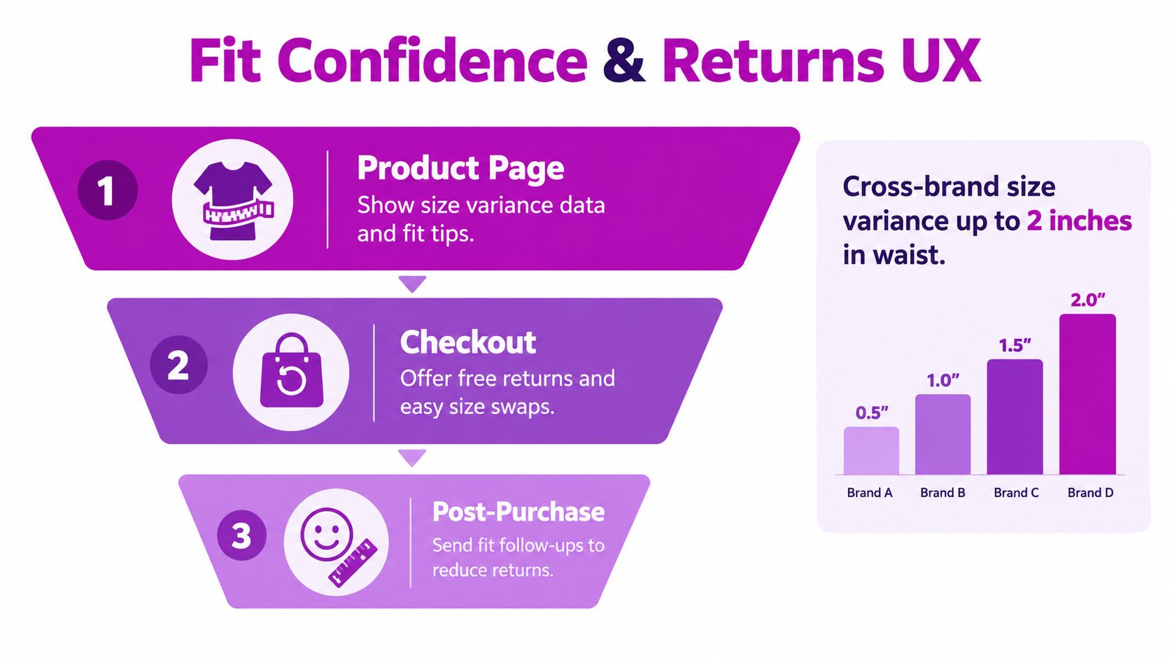
Vogue Business research found that 91% of consumers say their clothing size varies by brand, 43% are deterred by poor fit, and 38% frequently return ill-fitting clothes, which is why a generic size chart rarely solves the underlying issue. Vogue Business sizing survey breakdown The better answer is a fit system that reduces uncertainty before the add-to-cart moment.
A useful fit system combines a few elements instead of relying on one big promise. Standardized language like slim, regular, and oversized gives shoppers a quick read. Garment-specific measurement tables tell them what the item does. Model height and worn-size callouts help them map the product to a real body in a way that a size label alone never can.
The post-purchase side matters just as much. If the returns flow is clumsy, shoppers learn that buying clothing from your store is risky. An exchange-first flow is often better than an unconditional refund-heavy setup because it keeps the customer inside the brand relationship and gives them a second chance to find the right fit without forcing a full exit.
The strongest returns systems also feed information back into merchandising. If people keep returning a product because it's too small, the page copy, the measurements, and the photography need to change. If color mismatch is common, the imagery needs more honesty and consistency. If fabric surprises people, that's a content problem, not just an ops problem.
You can see the fit-and-returns logic in practice here:
The Right Apps and Integrations for a Clothing Storefront
App selection should feel like stack design, not shopping. A clothing store needs tools that support the buying decision, the post-purchase experience, and the internal workflow behind both, but every app also adds scripts, design debt, and another thing to maintain. The goal is to buy leverage, not clutter.
The categories that usually pay back first are reviews and UGC, size guidance, search and merchandising, email and SMS, and, once volume grows, an ERP or 3PL connector. Those pieces help shoppers trust the product and help the team keep the catalog in sync with actual inventory. If you're evaluating tools, look at whether the app improves a real friction point or just adds a badge to the page.
Fashion ecommerce is already a huge commercial space, with global revenue estimated at more than $920 billion in 2025 and about one-quarter of worldwide fashion sales happening online. Statista's fashion ecommerce overview That scale makes the merchandising and personalization stack worth treating carefully, because the brands that win are usually the ones that keep the storefront coherent while layering in the right support tools.
For apparel, AI tools can be useful when they're scoped properly. Generative product copy can speed up launches, search tuning can surface the right SKU faster, dynamic merchandising can adapt collection order, and customer-service automation can answer repetitive sizing and shipping questions. The catch is that these tools should help the team make better decisions, not bury the store in automation for its own sake.
A practical launch stack usually starts with three essentials:
- Size and fit support: So shoppers don't guess.
- Reviews or UGC: So product claims feel believable.
- Email capture and lifecycle messaging: So first-time traffic isn't wasted.
After the first revenue milestone, add search optimization, loyalty, and deeper analytics. Subscription logic for basics can wait unless replenishment is central to the brand. A partner like ECORN is typically useful when the question shifts from “Can we install this app?” to “Should we, and what does it do to page speed, design, and conversion?”
If you're comparing adjacent product categories and their operational stacks, the boutique jewelry sourcing guide is a good reminder that different products reward different integration priorities.
Performance and Checkout as One Conversion Workstream
A lot of brands treat page speed as a technical chore and checkout as a separate CRO project. That split is convenient, but it's wrong for clothing. The same shopper who waits for a collection page to load also gets annoyed by a clunky checkout, and both problems show up as the same thing in revenue terms, lost intent.
Google's “Milliseconds Make Millions” research reported that a 0.1-second mobile improvement was associated with a 10.1% increase in conversion rate. Google's performance research That's an observed result, not a promise, but it tells you why speed work belongs in the revenue conversation. When collection pages, search results, and product pages load faster, more shoppers reach the point where checkout even becomes relevant.
Checkout itself has its own friction profile. Baymard found that 64% of leading desktop sites and 63% of leading mobile sites have mediocre-or-worse checkout UX, with average cart abandonment near 70.19% and 17% of U.S. shoppers abandoning because checkout was too long or complicated. Baymard's checkout UX benchmark Those numbers make one thing clear, a lot of abandonment is preventable, but not all of it is.
The useful move is to audit the funnel in order, not by hunch. Start by recording the baseline by device, product view to add-to-cart to checkout start to payment completion. Then test the worst mobile and desktop paths with real users, because clothing shoppers often expose issues that internal teams miss. After that, inventory every visible field, shipping-cost disclosure, error state, guest-checkout path, and wallet option.
Practical rule: Don't redesign everything at once. Fix the highest-friction point, measure it, and only then move to the next one.
For clothing brands, the most valuable improvements are usually the obvious ones done cleanly. Make guest checkout prominent. Use address autocomplete. Show total landed cost before the final step. Keep carts persistent across sessions. Then run controlled A/B tests on the highest-friction changes instead of guessing your way through a full redesign.
One common mistake is treating a high abandonment rate as proof that the product isn't resonating. Baymard's research shows that a meaningful share of shoppers are browsing or not ready to buy, so you need to separate intent from friction before you make decisions. Compare abandonment by shipping country, device, traffic source, and new versus returning customer status, then judge changes by conversion rate, checkout completion, payment failure rate, and contribution margin together.
Scaling a Shopify Clothing Brand Across Storefronts and Markets
A single storefront works longer than many founders expect, but it doesn't work forever. The pressure usually shows up when you need multiple currencies, multiple languages, separate wholesale and retail catalogs, regional warehouses, or a second brand that doesn't fit neatly inside the first one. At that point, the question isn't whether the business is growing, it's whether the architecture can keep up.
The wrong assumption is that every scale problem needs a new store. Sometimes Shopify Markets is enough. Sometimes a second storefront is cleaner. Sometimes B2B on Plus is the answer. The right structure depends on how different the operations really are, not just how ambitious the plan sounds in a deck.
A useful internal reference is ECORN's guide to Shopify apparel stores, especially if you're mapping growth paths across fashion formats. The reason scale gets messy in clothing is that product data, fit systems, and merchandising logic need to remain consistent even when the business splits across regions or channels.
The brands that scale cleanly usually have three things in place before the move:
- Structured product data. If the catalog is messy, every new storefront multiplies the mess.
- A fit system shoppers understand. If sizing is vague, international growth makes it worse.
- A CRO habit. If you're not measuring changes on one store, you won't know what to protect on three.
Stay on one store if you're still operating in one primary market and your assortment is easy to manage. Move to Markets when localization becomes a real growth lever and the product set can stay unified. Plan a Plus migration with a partner when wholesale, B2B, or regional operations need more separation than one admin can comfortably handle.
The best time to think about the next storefront is before the current one starts breaking. Once the data model, returns logic, and checkout flow are stable, scaling stops being a rescue project and starts becoming a controlled expansion.
If you're building or rebuilding a Shopify clothing website, ECORN can help with storefront design, custom Shopify development, and CRO focused on the parts that move revenue, especially fit confidence, returns UX, performance, and checkout. Visit ECORN if you want a team that can turn apparel-specific friction into a cleaner, more scalable store.



How to Launch a Box Subscription Business in 2026

Luxury Skincare Branding Playbook That Converters
10 Best Podcast Ecommerce Shows for Store Growth in 2026
Shopify Developer Hourly Rate: What to Pay in 2026
Critical Shopify Setup Errors That Are Secretly Sabotaging Your Store
Ecommerce Conversion Tracking: The Complete How-To Guide

Shopify Design Agency: How to Pick the Right Partner
Mastering Multi Store Management on Shopify

Scale Shopify Store

10 Shopify App Ideas Worth Building in 2026
Conversion Rate Optimization for Landing Pages: The Playbook
Shopify Plus Automation: A Guide for 2026
10 Social Selling Platforms for Shopify Merchants

Shopify Website Design Examples: 7 Stores Worth Studying
7 Ecommerce Newsletter Examples for Shopify Brands
One Product Shopify Store: Build and Scale

Mobile Pop Up Strategy for Shopify Stores That Converts
Sitemap for Shopify: How to Find, Optimize, and Submit It

7 Single Product Websites Worth Emulating
Product Variants Shopify: The Complete 2026 Guide
Ecommerce Analytics Consulting for Growth

What Is AI Integration for eCommerce

How to Choose the Right eCommerce Website Development Firm
E Business Strategy Implementation
Conversion Tracking Setup for Shopify Stores
BigCommerce vs Shopify Plus Which Enterprise Wins in 2026
Shopify Theme Kit: Setup, Commands, and Migration Guide

Shopify Extension Development: A Practical 2026 Guide
Shopify Speed Score Explained and How to Improve It
Shopify Mobile Optimization: The 2026 Playbook
How to Add Subcategory in Shopify for Better UX
How to Implement Structured Data for Ecommerce in 2026

SEO App Mobile: Shopify Store Optimization Guide
Shopify Plus Support: What It Includes and How to Choose

Google Ads for Shopify: The Complete 2026 Playbook

Shopify New York: How to Find and Hire the Right Agency

Google Search Console for Shopify: The Complete Setup

First Party Data Collection for eCommerce Growth
FAQ Online Store Guide: Build and Measure It Right
Do FB Ads Work for eCommerce in 2026?
One Page Checkout for Shopify: Design and Implementation
Shopify GraphQL vs REST: The 2026 Developer Decision
Shopify Ecommerce Consulting: Strategy, Pricing &

Are Reddit Ads Worth It for eCommerce Brands
Shopify Title and Meta Description: A Practical 2026 Guide

Product Video Best Practices for Shopify Brands
Real-Time Inventory Management: A 2026 Guide

AI Chatbot Integration for Shopify Stores
Affiliate Program Management: A Shopify Guide
10 Best Performance Monitoring Tools for Shopify in 2026

Digital Asset Management for eCommerce Brands in 2026

Every Type of Facebook Ads Explained for eCommerce Growth
Product Information Management Explained for Shopify Brands
Support Ticket System: A Guide for Shopify Stores

10 Best Customer Service Tools for Shopify in 2026

Can I Start a Business with No Money? a 2026 Blueprint

What Sells Good on Etsy: Best Niches for 2026

Shopify Add to Cart Button: A Practical 2026 Guide

Customer Feedback Automation: A Practical eCommerce Guide
Critical Rendering Path: A Guide for Shopify Stores

How to Promote on TikTok for eCommerce in 2026

B2B eCommerce Consulting That Drives Real Revenue

10 Best Practices for Site Navigation in 2026
Return vs Refund for Shopify Stores: A Practical Guide
What Is Customer Lifetime Value and Why It Matters
What Is Voice of Customer Research for eCommerce

SMS Marketing for Ecommerce That Actually Converts

Master How to Improve Email Deliverability in 2026

Top 8 eCommerce Partners NYC for Shopify Brands in 2026

Machine Learning for Ecommerce: Boost Your Shopify Store

Beauty Market Research: Your 2026 Growth Guide

Shopify International Expansion: A 2026 Roadmap
What Does CRO Stand for in Business: Understanding CRO

Shopify Visual Merchandising: A Playbook for Higher Sales

Shopify Landing Page Design: Master Conversion in 2026

10 Best AI SEO Optimization Tools for Shopify in 2026

Agentic AI for Ecommerce: Boost Your Sales in 2026
Mastering Email Marketing Data for eCommerce Growth

Conversion Rate Optimisation Australia: Boost Your Sales
Conversion Rate Optimization AI: Your Shopify Store Guide

10 Product Bundling Strategies for Shopify in 2026
How to Increase Customer Lifetime Value: A Shopify Playbook
AI Customer Service Automation: Shopify Guide 2026

Clean Website Design: A Shopify Conversion Playbook

Omnichannel Retail Strategy: A Shopify Playbook
Product Data Enrichment: A Guide for Shopify Brands
Instagram Shopping Features a Guide for Shopify Stores
What Is Revenue Optimization: A Holistic RevOps Guide

Benefits of Conversion Rate Optimization: Boost Your
WordPress to Shopify Migration: Your 2026 Seamless Switch
Boost Sales: Ecommerce Payment Processing Guide 2026
Unified Commerce Platform: Benefits, KPIs & Shopify Guide

How to Reduce Bounce Rate eCommerce: Your 2026 Guide
Shopify API Integration: A Practical End-to-End Guide

How to Implement Data Governance: A 2026 Guide
Shopify Store Development Cost: A 2026 Breakdown
What Is Server Side Tracking: The Shopify Guide 2026
Marketing Automation Workflows: A Shopify Guide for 2026
Shopify: How to Reduce Technical Debt

Shopify UX Design Change: A Playbook for Growth


newsletter in your inbox