

Strip everything out and your store will get faster. That's the most popular advice about a Shopify theme Minimal build, and it's wrong often enough to cost sales. A page can look empty and still load heavy video, render-blocking fonts, and three app scripts before a shopper can tap anything. It can also look clean because you removed the delivery note, the review summary, and the returns line that gave a first-time buyer confidence to pay. I define minimal by rendering cost, not by white space. Keep what helps a shopper decide. Defer what can wait. Cut what blocks the first paint without earning its place.
What a Minimal Shopify Theme Should Keep, Defer or Cut
A minimal Shopify theme is not automatically a high-performing theme. Shopify's theme performance best practices tie mobile speed to real-device CPU, memory, network conditions, responsive image delivery, conditional Liquid rendering, tap-target sizing, and avoiding intrusive overlays. Visual emptiness doesn't fix any of those. A hero video, a chat widget loading on entry, and a review app injecting JavaScript above the fold will slow a spare-looking page more than a compact delivery note ever will.
The right target is minimum rendering cost, not minimum content. Mobile phones have constrained memory and slower processors, and they run on variable networks. That means you should measure minimal through Largest Contentful Paint (LCP), Interaction to Next Paint (INP), and Cumulative Layout Shift (CLS) on representative devices. If an element doesn't move those metrics and it helps a shopper decide, keep it, even if a purist would call it clutter.
Why trust elements stay
Removing navigation, reviews, delivery information, or merchandising blocks can make a mockup look serene while weakening product confidence. Say you sell a $120 skincare set. A shopper who's never bought from you needs the price, the variant, a star summary, and one line that says when it ships and how returns work. Remove those and she doesn't experience minimalism. She experiences doubt, and she leaves to check a competitor who answered the questions.
Keep those answers small and cheap. A review star summary is a few characters of text and an SVG. A delivery note is one line of HTML. Neither needs a third-party script, a network request to another domain, or a layout shift. The expensive version is the full review widget, the animated trust badge carousel, and the pop-up that covers the buy button.
Practical rule: If an element answers a buying question in plain HTML, it's almost always cheap enough to keep. If it needs an external script to appear, it has to justify that cost.
Storefront elements keep defer or cut on a minimal theme
| Element | Verdict | Why it matters | Rendering cost |
|---|---|---|---|
| Primary navigation | Keep | Readers need a route to every collection | Low |
| Product images with zoom | Keep | Photos carry the sale on visual categories | Medium, needs responsive sizes |
| Price and variant selector | Keep | Blocks purchase when it lags | Low |
| Add to cart button | Keep, sticky on mobile | Primary action must stay visible | Low |
| Review star summary | Keep | Compact trust signal near the buy button | Low |
| Full review widget | Defer | Long third-party script, belongs below the fold | High |
| Delivery and returns note | Keep | Removing it weakens purchase confidence | Low |
| Hero video | Defer or replace | Heavy media often becomes the LCP element | High |
| Related products carousel | Defer | Lazy-load after the main content | Medium |
| Promo bar | Cut unless tied to a live campaign | Shifts layout and moves content down | Medium, causes layout shift |
| Newsletter pop-up | Cut | Overlays block taps and hurt interaction scores | Medium |
| Chat widget | Defer | Load on interaction, not on page load | High if loaded early |
| Duplicate trust badges | Cut | Repeated content adds noise without trust | Low |
Notice the pattern in the defer column. I'm not telling you to delete reviews, related products, or chat. I'm telling you to move their cost out of the critical path. Load the full review widget when a shopper scrolls to it or taps the star summary. Lazy-load the related products carousel after the main product content has painted. Load chat when someone taps a lightweight button you've rendered yourself, not when the page opens.
The cut column is shorter, and that's deliberate. A newsletter pop-up on entry blocks taps and covers content on a small screen. A promo bar for a campaign that ended, or that never had a real offer, only pushes content down and shifts it again when a font loads. Duplicate trust badges in the buy box, under the description, and in the footer don't triple trust. They signal that you don't trust your own page.
Three tests before you keep anything
Run every element through these questions before it earns a place above the fold:
- Does it help the reader decide: Does it answer price, fit, delivery, returns, or social proof, or does it only decorate?
- Does it block the first paint: Does the browser have to download, parse, or execute something before the main image and headline can appear?
- Does it add a third-party script: If yes, can you render a static placeholder yourself and load the script on scroll or tap instead?
An element that helps a decision, doesn't block paint, and needs no external script stays. An element that fails two of the three tests gets deferred or cut, no matter how good it looks in a desktop screenshot. That's the discipline. You're not counting components. You're counting milliseconds, layout shifts, and blocked taps.
Layout Patterns That Make a Minimal Storefront Work
Say a small jewelry store sells twelve necklaces and rings, and photography is the only salesman it has. The first screen shouldn't explain the brand for three paragraphs. It should show one strong image, one headline, and one button. A header like the one below works because the product carries the message and the layout gets out of the way.
That product-first logic is the heritage of Shopify's own Minimal theme. As the Website Planet guide to Shopify templates describes it, Minimal was a free, product-focused design with three variants, Vintage, Fashion, and Modern, each using different color schemes, typography, and layouts. Pick the logic, not just the colors. A Modern style grid suits cameras and furniture. A Fashion style treatment suits apparel. Vintage suits art and handmade goods where typography sets the mood.
Minimal emphasized high-definition imagery, homepage video, slideshows, image zoom, and related-product sections for visually led categories such as jewelry, art, furniture, fashion, and cameras. It offered fewer built-in marketing features than advanced themes, which is why it worked best for a small number of products. That constraint is a feature for a focused catalog. It's a warning sign for a store with hundreds of SKUs and complex filtering needs.
Three patterns that hold up
Pattern one, single-column hero. Use this on the homepage for a small catalog. One image at a responsive size, one headline under ten words, one button that goes to a collection or a hero product. Don't add a slideshow. A rotating hero delays the message, multiplies image weight, and usually means the second and third slides are never seen. If you need movement, use one short muted video below the first screen, not as the first paint.
Pattern two, two-column product page with a sticky buy box. On desktop, put images on the left and keep price, variant selector, delivery note, and add to cart sticky on the right while the shopper scrolls through photos. Collapse the long description, ingredients, or sizing details into accordions beneath. On mobile, stack it in decision order: image, title, star summary, price, variants, buy button, then details. The sticky mobile add to cart earns its keep here because the shopper doesn't have to scroll back up to act.
Pattern three, collection grid with filters in a drawer. Show three or four columns on desktop and two on mobile, with consistent image aspect ratios so the grid doesn't jump as images load. Put filters and sorting in a drawer instead of a permanent sidebar. A sidebar steals a quarter of the screen to show options most shoppers use once. A drawer gives that width back to product photos, which is where the selling happens. For a deeper treatment of how grids and drawers should adapt across breakpoints, this guide to responsive design for ecommerce stores covers the practical decisions well.
The video below walks through how these layout choices look when they're applied to a real storefront, so you can see the spacing and hierarchy rather than imagining them.
Type and spacing rules
Set body text at 16 px or larger on mobile so browsers don't force a zoom and shoppers don't pinch to read a size note. Keep reading width at 60 to 75 characters for descriptions and blog content. Beyond that, the eye loses the next line and skimming gets harder. Reserve one accent color for actions only, buttons and links, so a shopper can spot what's tappable without reading. Use white space between sections instead of divider lines and background bands. Space groups content without adding markup, borders, or extra CSS. Those choices are the foundation of clean website design that still converts, because hierarchy comes from size and spacing rather than decoration.
Every template gets one main message and one primary action per screen. If a shopper can't tell within three seconds what this screen wants her to do, the layout has failed, no matter how tidy it looks.
How to Build the Theme Structure Step by Step
Build in small, reversible pieces. A minimal theme isn't a blank file. It's a set of narrow sections, assigned to the right templates, with only the settings a merchant needs. The process below keeps you from painting yourself into a corner with one giant template full of conditional logic.
The four-part overview in this infographic shows the shape of the work before you get into the detail.
The seven steps
- Duplicate the live theme: Work on the copy and keep the published theme untouched. If a section breaks a product page at 11 p.m., you roll back in one click instead of debugging live traffic.
- Define the content model: List each page type and the blocks it needs before you write markup. A product page might need hero media, buy box, delivery note, accordion details, and deferred reviews. A collection needs a header, grid, and filter drawer. Writing this list first stops you building sections nobody uses.
- Create one narrowly scoped section per block: Give each section a valid schema and expose only settings that affect a business decision, such as heading text, image, and button link. Don't expose margin sliders and font pickers per section. Merchants will use them inconsistently and you'll carry the CSS forever.
- Add presets for safe insertion: A preset lets a merchant add your section in the theme editor with sensible defaults already filled in. Without one, sections get inserted empty, look broken, and generate support tickets that aren't really bugs.
- Assign sections to JSON templates: Keep product, collection, cart, and content templates separate. According to the Shopify JSON templates documentation, JSON templates store the ordered list of sections and their settings and let merchants add, remove, and reorder sections in the theme editor.
- Test rendering and compatibility: Check desktop and mobile layouts, localization strings, keyboard access through filters and the cart drawer, and app-block compatibility. Test with a long German product title and a right-to-left language if you sell internationally. Tight minimal layouts break first on text length.
- Version-control and document the schema: Commit each change separately and write down what each section setting controls. Six months later, that contract tells the next developer whether a setting is safe to remove or whether three templates depend on it.
Limits that break builds
Respect the platform ceilings while you design, not after you hit them. A JSON template supports up to 25 sections, and each section can contain up to 50 blocks. If you're approaching 25 sections on a product template, that's not a limit problem. It's a hierarchy problem. You've probably split one logical area into five sections or kept campaign sections that should live on a landing page template instead.
Understand what a schema does. A section schema defines configuration metadata only. It doesn't output Liquid. Beginners lose hours writing logic inside a schema and wondering why nothing renders. Your markup and Liquid live in the section file. The schema only declares the settings and blocks the editor can control.
Build rule: Use separate templates for materially different experiences. A pre-order product page and a standard product page should be two JSON templates, not one file wrapped in if statements.
Pitfalls I would avoid
The most common failure is the overly generic section. A developer builds one mega section called Flexible Content with forty settings to handle heroes, testimonials, and feature lists. It looks efficient. In practice, every instance loads CSS for layouts it isn't using, merchants can't tell which settings apply, and a change for the hero breaks the testimonial. Build three small sections instead. Small sections are easier to test, easier to delete, and cheaper to render.
Watch for duplicated CSS across sections. If each section ships its own button styles, grid rules, and spacing utilities, your stylesheet grows with every feature and the browser parses the same rules repeatedly. Put shared styles in one base file. Let a section carry only the CSS that's unique to it, and remove that CSS when you remove the section.
Excessive section density creates a heavy DOM even when each section looks light. Ten sections with nested wrappers, sliders, and app blocks can produce thousands of nodes the phone has to lay out on every scroll and tap. Count DOM size the way you count scripts. If a section doesn't help a shopper decide on that template, it doesn't belong there, even if it's beautifully built.
Customization Options That Keep the Theme Lean
The more a merchant can change without a developer, the more markup and scripts your theme may end up carrying. That's the trade-off you have to manage, not avoid. A theme nobody can edit gets replaced. A theme everybody can edit in every direction gets slow. The answer is to offer customization in layers, cheapest first, and put guardrails on the expensive layers.
Customization options and their trade-offs
| Option | Best for | Who edits it | Performance risk |
|---|---|---|---|
| Theme settings (colours, fonts, radius) | Brand consistency | Merchant | Very low |
| Section settings in JSON templates | Reordering homepage and collection layouts | Merchant | Low to medium |
| Theme blocks | Reusable campaign content and merchandising | Merchant, within block limits | Medium, grows with block count |
| Custom Liquid section | One-off structure no setting can express | Developer | Set by markup and loops in the code |
| Third-party app embed | Reviews, pop-ups, chat | Merchant installs, developer configures | High, adds external scripts |
Theme settings cost almost nothing because they change values in CSS you already ship. Let a merchant control brand colors, two font choices at most, and corner radius globally. Section settings are next. They let a merchant reorder a homepage or swap a collection image without code, and the risk stays low as long as each section renders only what its settings require. Use conditional Liquid so a disabled video block doesn't leave an empty player and its scripts behind.
Theme blocks need a count limit. A reusable promo block is useful. Twenty nested blocks inside a section, each with its own image and animation setting, is a page builder growing inside your minimal theme. Cap blocks where the design breaks anyway. If a feature list looks wrong past four items, set the limit at four and say why in the schema label. For a broader look at how to structure these layers, these theme customization patterns show how other teams draw the line between settings and code.
Custom Liquid sections are for the one layout no setting can express, such as a size finder that reads product metafields. Only a developer should edit them, because a loop over every product in a large collection can turn a small section into your slowest render. App embeds sit at the expensive end. A merchant can install one in a minute, and it can add external JavaScript to every page, including pages where the app does nothing. Audit embeds quarterly. Remove the ones nobody remembers installing.
The modular direction changes the calculation
Shopify's platform is moving toward modularity, so don't judge a minimal theme only against older templates. The Shopify Winter 2025 Editions expanded no-code Theme Blocks and more granular customization, and Shopify reported cart requests loading up to 50% faster and accelerated checkout buttons up to 58.8% faster. That matters because a modular theme can now add richer merchandising and personalization without a heavily customized codebase.
It doesn't remove the ceiling. Nested blocks, app embeds, tracking scripts, and dynamic content will still erase your performance advantage if you add them without measuring. The best modern minimal theme is a controlled design system, not the theme with the fewest visible components. You control it with block limits, approved section types, and a rule that nothing ships until it's been measured.
Use minimal templates for high-intent paths such as product and cart. Use blocks for experiments on landing pages. A failed experiment should cost you a landing page test, not your product page speed.
International brands feel this tension most. You need content parity, localization, and market-specific merchandising across stores. Blocks help you reuse structure while swapping market content, but only if you keep the block library small and documented. I'd rather give a multi-market team eight approved blocks they can combine safely than thirty options that produce thirty inconsistent, heavy pages.
Performance and Accessibility Checks Before You Launch
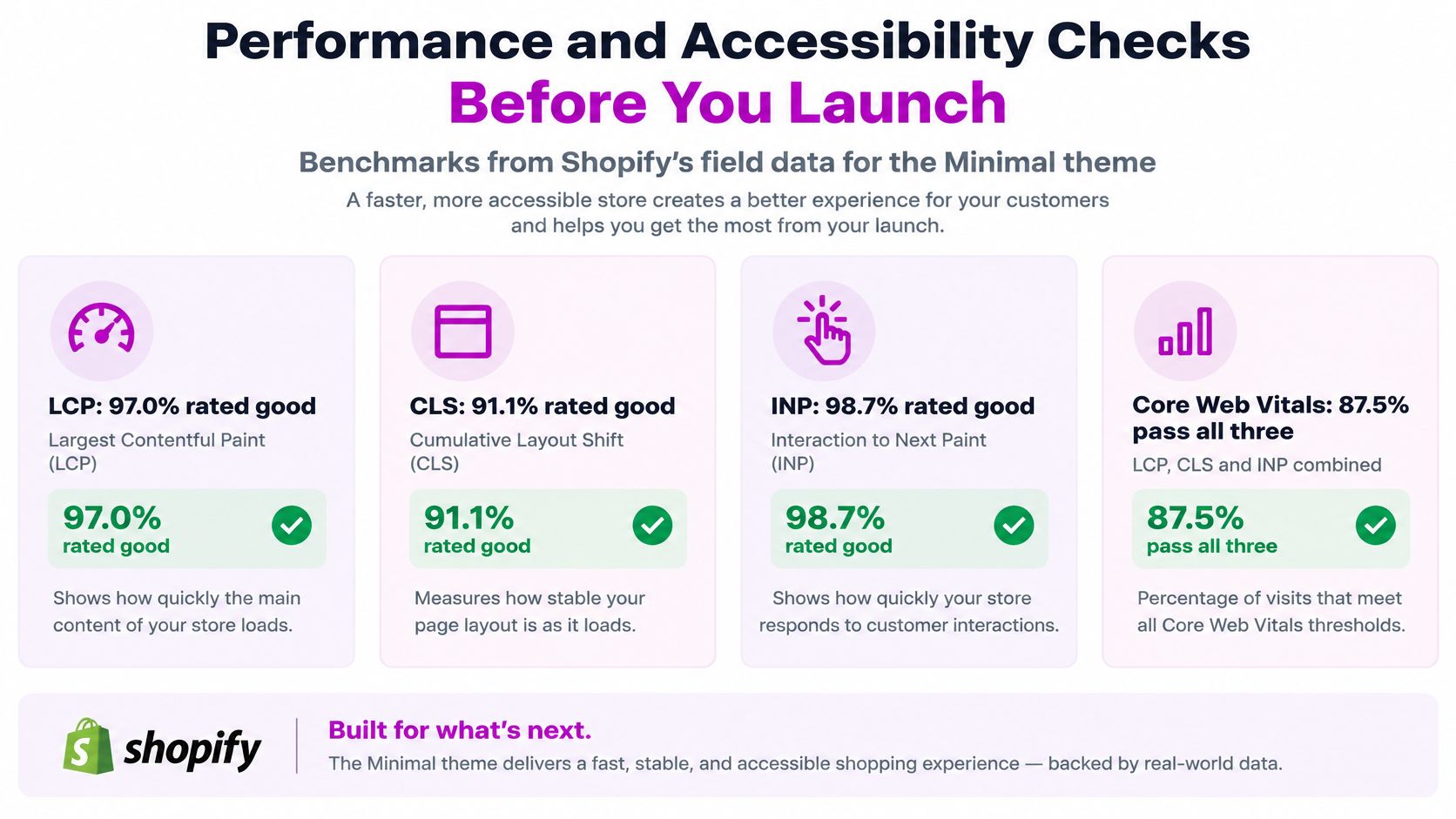
Start with a benchmark, then prove your store matches it. Shopify's Web Performance reports documentation lists the Minimal theme at 97.0% "good" LCP, 91.1% "good" CLS, 98.7% "good" INP, and 87.5% passing all Core Web Vitals. Those are aggregated field results from real visitors. They're a target to compare against, not a promise your store will inherit by installing the theme.
The infographic below puts those four benchmarks in one place for your launch checklist.
Your store can fall well below those numbers. Third-party app JavaScript, oversized hero media, render-blocking fonts, and layout-changing promotional bars pull scores down fast. One uncompressed hero video becomes the largest element on the page and drags LCP with it. One announcement bar injected after paint pushes the headline down and registers as layout shift for every visitor.
Core Web Vitals benchmarks and the usual minimal-theme fix
| Metric | Minimal theme good share | Usual cause | Fix |
|---|---|---|---|
| Largest Contentful Paint (LCP) | 97.0% | Oversized hero image or video | Compress, size responsively, preload the hero |
| Cumulative Layout Shift (CLS) | 91.1% | Promo bars and late-loading fonts | Reserve space, preload fonts, fix bar height |
| Interaction to Next Paint (INP) | 98.7% | Heavy app JavaScript on tap | Defer noncritical scripts, remove unused apps |
Fonts deserve specific attention because they cause both delay and shift. A custom font that loads late swaps text in a different width and moves everything around it. Limit yourself to the weights you use, preload the primary font, and check the web font speed and licensing risks before you self-host or hotlink a file you don't have rights to ship. For the full optimization workflow behind these fixes, keep a Shopify page speed optimization checklist beside your launch plan.
Verify with field data, not just a lab score
After each build or customization change, compare mobile field data before and after in Shopify's Web Performance reports. The reports separate desktop and mobile and show the effect of app installs, theme updates, and code changes, so you can attribute a drop to the thing you shipped yesterday instead of guessing. Preserve the higher-performing version when a change makes things worse. That sounds obvious, and teams skip it constantly because the new feature is already announced.
Don't rely only on a synthetic Lighthouse run from your office connection. Your shoppers aren't on your office connection. Test collection filtering, product variant selection, the cart drawer, and the checkout handoff on a throttled mobile network on a mid-range Android phone. Those are the paths where a slow script costs a sale, because the shopper has already decided and you're making her wait to act on it.
Accessibility checklist before you publish
- Tap targets: Make buttons and links at least 24 by 24 CSS pixels, with enough spacing that a thumb doesn't hit the wrong variant.
- Text contrast: Keep body text at a contrast ratio of at least 4.5 to 1 against its background. Pale gray text on white is not minimal. It's unreadable.
- Visible focus rings: Never remove the outline on focused elements to make the design cleaner. A keyboard shopper needs to see where she is.
- Alt text: Write descriptive alt text for product images that conveys color, material, and angle, not file names or keyword strings.
- Keyboard operation: Confirm filters, accordions, and the cart drawer open, close, and trap focus correctly without a mouse.
- Reduced motion: Respect the reduced-motion setting on autoplay video and animated transitions. Pause or replace movement for shoppers who've asked their device not to animate.
Release gate: No change goes live until you've compared its mobile LCP, CLS, and INP against the previous version and kept the better one.
Decide Whether to Build In-House or Hire a Team
You don't need outside help to build a lean theme. You need it when the scope outgrows the hours and testing discipline you can sustain. Be honest about which situation you're in, because the expensive mistake is hiring for a small job or attempting a multi-market rebuild in spare evenings.
Build in-house when the scope is contained
Build it yourself when you run one store in one market, your catalog is small, and you can test every change against your own mobile field data. A focused store with twenty products, one language, and a short app list is exactly the case a minimal theme was made for. You can duplicate the theme, build a handful of sections, defer two widgets, and measure the result in a week of focused work.
You also need one person who owns the release gate. If nobody compares field data after a change, you'll add apps and blocks until the theme is minimal in name only. Ownership matters more than coding skill here. A merchant who checks performance reports monthly will keep a simple theme fast longer than a developer who builds brilliantly and never looks back.
Hire a team when complexity multiplies
Bring in outside help when you manage several storefronts, need content parity and localization across markets, run a Shopify Plus store, or have already watched performance drop after app installs and can't find the cause. At that point the work is less about writing a section and more about governing a system across stores, languages, and teams. We're an official Shopify Partner Agency, and our work in this situation centers on custom Shopify themes with conversion rate optimization, with Shopify Expertise packages that require no commitment if you want to start with a defined piece of work.
Whichever path you take, ask any provider, including us, three questions and check the answers against the keep, defer, or cut table:
- What would you defer or cut, and why: A good answer names specific widgets and scripts, not vague promises to optimize.
- How do you test on real mobile data: Look for field data from Web Performance reports and throttled device testing, not only desktop lab scores.
- How do you document section schemas: You should receive a written contract for what each setting controls, so your team can edit safely later.
A provider who wants to add elements before asking what can be deferred will build you a heavier theme and call it minimal because it has lots of white space.
The first step is identical either way, and you can do it today. Duplicate your live theme. Run the keep, defer, or cut review on your current product and collection pages. Record your mobile LCP, CLS, and INP from the performance reports as your baseline. From that point, every decision has a number attached to it, and minimal stops being a style preference. It becomes a measured property of your store that you can defend, improve, and keep.
If your store has outgrown a template you can govern alone, whether that's multiple markets, a Shopify Plus build, or performance that's slipped after app installs, ECORN builds custom Shopify themes with conversion rate optimization built into the work, so the keep, defer, or cut discipline is measured against real mobile data rather than guessed at. Visit us to talk through your current baseline numbers and get a scoped plan for a leaner theme that still gives shoppers every reason to buy.


Consistent Website Design: A Practical Guide for Stores

Shopify Development Company in USA Hiring Guide
Shopify Inventory Tracking App: How to Set It Up Right
Shopify Volume Pricing: How to Set Up Tiered Discounts
How Does Shopify Work for Sellers? a Practical Guide
Shopify Theme ZIP: How to Upload and Install It
Shopify Plus Organization Admin: Roles and Access Guide
How to Build a Drop Down Menu in Shopify: Steps and Fixes
Shopify Plus Integration Services Guide

Shopify Customer Experience: A 2026 Guide

AI Lead Generation for E-commerce Growth

Shopify Plus Expansion Stores: Limits and Setup
Shopify Theme Update: Safe Steps, Backups and Rollback

Shopify Website Design Packages: What You Actually Get

How to Choose a Shopify Plus Web Design Agency in 2026
Shopify Plus Ecommerce Agency: How to Pick the Right One
Shopify Themes Retina: How to Serve 2x Images

How to Cross Sell on Shopify Without Friction

Best Shopify Theme for Custom Products Compared
Multi Store Inventory Management: A Practical Guide

SEO Consulting for Ecommerce: A Practical Guide

Shopify Theme Updater App: A Safe Update Playbook

Shopify Git Integration: A Developer's Guide to 2026
Headless Ecommerce Development Services Explained

How to Build a Shopify Clothing Website That Converts

How to Launch a Box Subscription Business in 2026

Luxury Skincare Branding Playbook That Converters
11 Best Podcast Ecommerce Shows for Store Growth in 2026
Shopify Developer Hourly Rate: What to Pay in 2026
Critical Shopify Setup Errors That Are Secretly Sabotaging Your Store
Ecommerce Conversion Tracking: The Complete How-To Guide

Shopify Design Agency: How to Pick the Right Partner
Mastering Multi Store Management on Shopify

Scale Shopify Store
10 Shopify App Ideas Worth Building in 2026
Conversion Rate Optimization for Landing Pages: The Playbook
Shopify Plus Automation: A Guide for 2026
10 Social Selling Platforms for Shopify Merchants

Shopify Website Design Examples: 7 Stores Worth Studying

7 Ecommerce Newsletter Examples for Shopify Brands

One Product Shopify Store: Build and Scale
Mobile Pop Up Strategy for Shopify Stores That Converts

Sitemap for Shopify: How to Find, Optimize, and Submit It

7 Single Product Websites Worth Emulating
Product Variants Shopify: The Complete 2026 Guide

Ecommerce Analytics Consulting for Growth

What Is AI Integration for eCommerce

How to Choose the Right eCommerce Website Development Firm

E Business Strategy Implementation
Conversion Tracking Setup for Shopify Stores
BigCommerce vs Shopify Plus Which Enterprise Wins in 2026
Shopify Theme Kit: Setup, Commands, and Migration Guide

Shopify Extension Development: A Practical 2026 Guide
Shopify Speed Score Explained and How to Improve It
Shopify Mobile Optimization: The 2026 Playbook
How to Add Subcategory in Shopify for Better UX
How to Implement Structured Data for Ecommerce in 2026

SEO App Mobile: Shopify Store Optimization Guide
Shopify Plus Support: What It Includes and How to Choose

Google Ads for Shopify: The Complete 2026 Playbook

Shopify New York: How to Find and Hire the Right Agency

Google Search Console for Shopify: The Complete Setup

First Party Data Collection for eCommerce Growth
FAQ Online Store Guide: Build and Measure It Right
Do FB Ads Work for eCommerce in 2026?
One Page Checkout for Shopify: Design and Implementation
Shopify GraphQL vs REST: The 2026 Developer Decision
Shopify Ecommerce Consulting: Strategy, Pricing &

Are Reddit Ads Worth It for eCommerce Brands
Shopify Title and Meta Description: A Practical 2026 Guide

Product Video Best Practices for Shopify Brands
Real-Time Inventory Management: A 2026 Guide

AI Chatbot Integration for Shopify Stores
Affiliate Program Management: A Shopify Guide
10 Best Performance Monitoring Tools for Shopify in 2026

Digital Asset Management for eCommerce Brands in 2026

Every Type of Facebook Ads Explained for eCommerce Growth
Product Information Management Explained for Shopify Brands
Support Ticket System: A Guide for Shopify Stores

10 Best Customer Service Tools for Shopify in 2026

Can I Start a Business with No Money? a 2026 Blueprint

What Sells Good on Etsy: Best Niches for 2026

Shopify Add to Cart Button: A Practical 2026 Guide

Customer Feedback Automation: A Practical eCommerce Guide
Critical Rendering Path: A Guide for Shopify Stores

How to Promote on TikTok for eCommerce in 2026

B2B eCommerce Consulting That Drives Real Revenue

10 Best Practices for Site Navigation in 2026
Return vs Refund for Shopify Stores: A Practical Guide
What Is Customer Lifetime Value and Why It Matters

What Is Voice of Customer Research for eCommerce

SMS Marketing for Ecommerce That Actually Converts

Master How to Improve Email Deliverability in 2026

Top 8 eCommerce Partners NYC for Shopify Brands in 2026

Machine Learning for Ecommerce: Boost Your Shopify Store

Beauty Market Research: Your 2026 Growth Guide

Shopify International Expansion: A 2026 Roadmap

What Does CRO Stand for in Business: Understanding CRO

Shopify Visual Merchandising: A Playbook for Higher Sales

Shopify Landing Page Design: Master Conversion in 2026


newsletter in your inbox