

Seven in ten online shopping carts never become orders. Shopify puts the average shopping-cart abandonment rate at 70.19% in 2024, citing Baymard Institute research, in its guide to shopping cart abandonment. That figure isn't a verdict on your cart page, and no single tweak moves it.
The seven changes below are worth shipping on a Shopify store because each one can be implemented, measured, and rolled back. Each also comes with the failure mode that bites, since the same drawer, progress bar, or upsell that lifts checkout starts on one store can cost sales on another. That's the practical shape of Shopify cart page optimization: cut one leak, prove it closed, then cut the next.
1. Slide-Out Cart Drawer
A drawer slides over the product or collection page the moment someone adds an item, so review, quantity edits, and checkout happen without a page load or a back button. Dawn ships this as a switch, not a project: open the theme editor, go to Theme settings, then Cart, and set Cart type to Drawer.
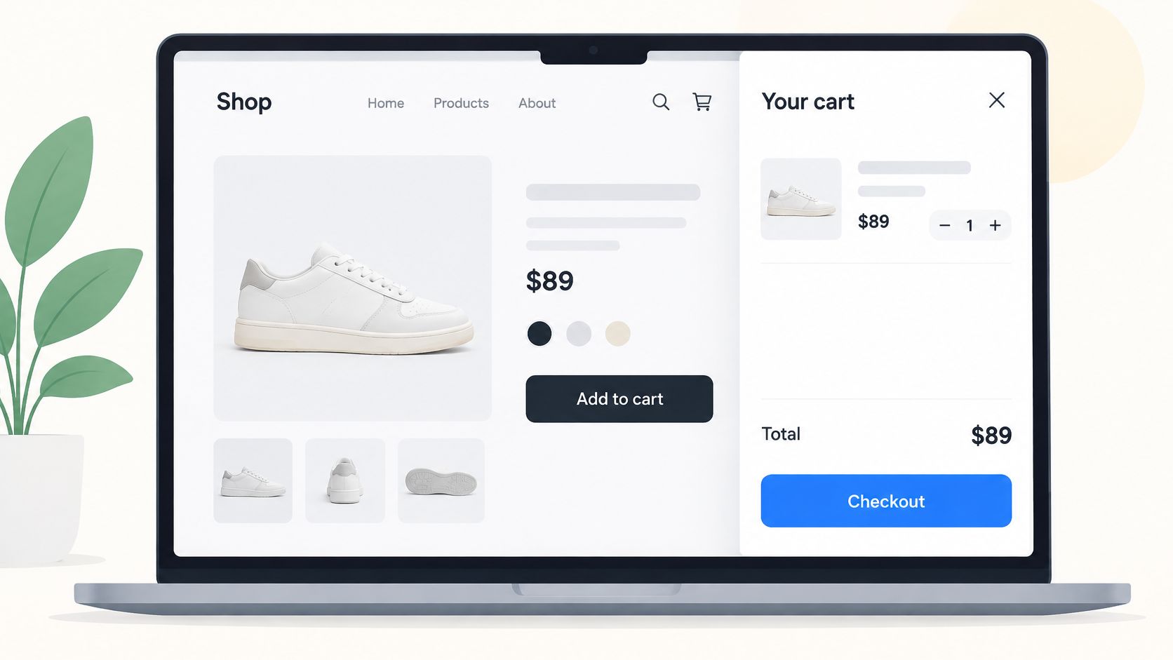
The gain is distance. Fewer screens between add-to-cart and payment, and the shopper keeps the context that made them add the item in the first place. Treat it as one change in a bigger pool, though. Baymard Institute's checkout usability research, built on a benchmark of 344 e-commerce sites, finds the average large e-commerce site has around 32 checkout-flow improvements available, with stronger checkout UX potentially producing a 35% conversion-rate increase. Shipping a drawer and calling the cart finished is how stores end up with a prettier version of the same leak.
Where the drawer backfires
- Open-on-add fires every time: someone building a five-item order gets interrupted five times. Auto-open on the first add in a session, then switch to a quiet cart icon.
- Two editing surfaces drift: themes that keep both the drawer and the cart page often render stale line items in each. Decide which surface owns editing and make the other read-only.
- Analytics go dark: a drawer doesn't fire a page view, so cart-page exit tracking disappears. Instrument a
cart viewedevent explicitly.
Practical rule: if the drawer can't be closed with the Escape key and doesn't return focus to the add-to-cart button, it isn't finished.
Here's the interaction in motion, including how a continue-shopping link keeps a hesitant shopper inside the compartment rather than bouncing them out.
2. Free Shipping Progress Bar and Threshold Messaging
Shopify doesn't ship a progress bar. You either render one in Liquid against cart.total_price, or you install an app that does it for you. That gap matters, because delivery cost is the lever shoppers respond to most: roughly 70% of U.S. online shoppers considered free shipping the most important delivery criterion, compared with 60% for fast shipping, according to Statista's data on U.S. checkout abandonment reasons.
The mechanics are simple, and the details are where stores get it wrong. Show the remaining gap as a currency amount ("$12 away from free shipping"), not a percentage, because a percentage asks the shopper to do arithmetic. Recalculate against the subtotal your shipping rule evaluates, which usually means after line-item discounts and cart-level discount codes. And render the same message on the cart page and in the drawer, or you'll get support tickets about a bar that says one thing in one place and something else in another.
Trade-off: a threshold bar that adds $8 to average order value while burning $10 of margin per order is a pay cut dressed as a win. Measure gross profit, not average order value alone.
The threshold itself is a shipping-rate decision before it's a design decision, and the rate mechanics are covered in this guide to Shopify shipping rate strategies. A sensible starting test sits 10 to 20 percent above your median order value, with a suggested add-on priced to close the gap in one click.
3. Express Checkout Buttons on the Cart Page
Wallets do the work here. Shop Pay, Apple Pay, Google Pay, and PayPal let a returning shopper pay from the cart with stored credentials, and Shopify reports Shop Pay can convert up to 50% better than guest checkout, as stated in its 2023 checkout extensibility announcement. That same release marked the platform's move to app-based, upgrade-safe checkout customization, which matters for Plus stores planning cart-to-checkout work.
Implementation is mostly a settings check. Turn on the wallets you support under Settings, Payments, then confirm your cart template renders them; in Dawn that's the additional_checkout_buttons block calling {{ content_for_additional_checkout_buttons }}. If the block is missing or wrapped in a condition that fails, the buttons vanish and nobody notices for a month.
The trade-off nobody mentions
An express checkout is fast because it skips things you built. Discount code entry, cart upsells, gift notes, and the shipping estimate all get bypassed. On mobile, where thumb reach favours the top button, shoppers will take the fastest route and your carefully placed add-on slot never loads.
- Order matters: standard checkout first on desktop, express first on mobile, then test the reverse.
- Check every platform: a wallet enabled in settings can still fail on an older Android browser. Test on an iPhone and an Android device.
- Read your gateway data: pull orders by payment method monthly and let the split decide which buttons deserve prominence.
4. Cart Page Upsells and Cross-Sells
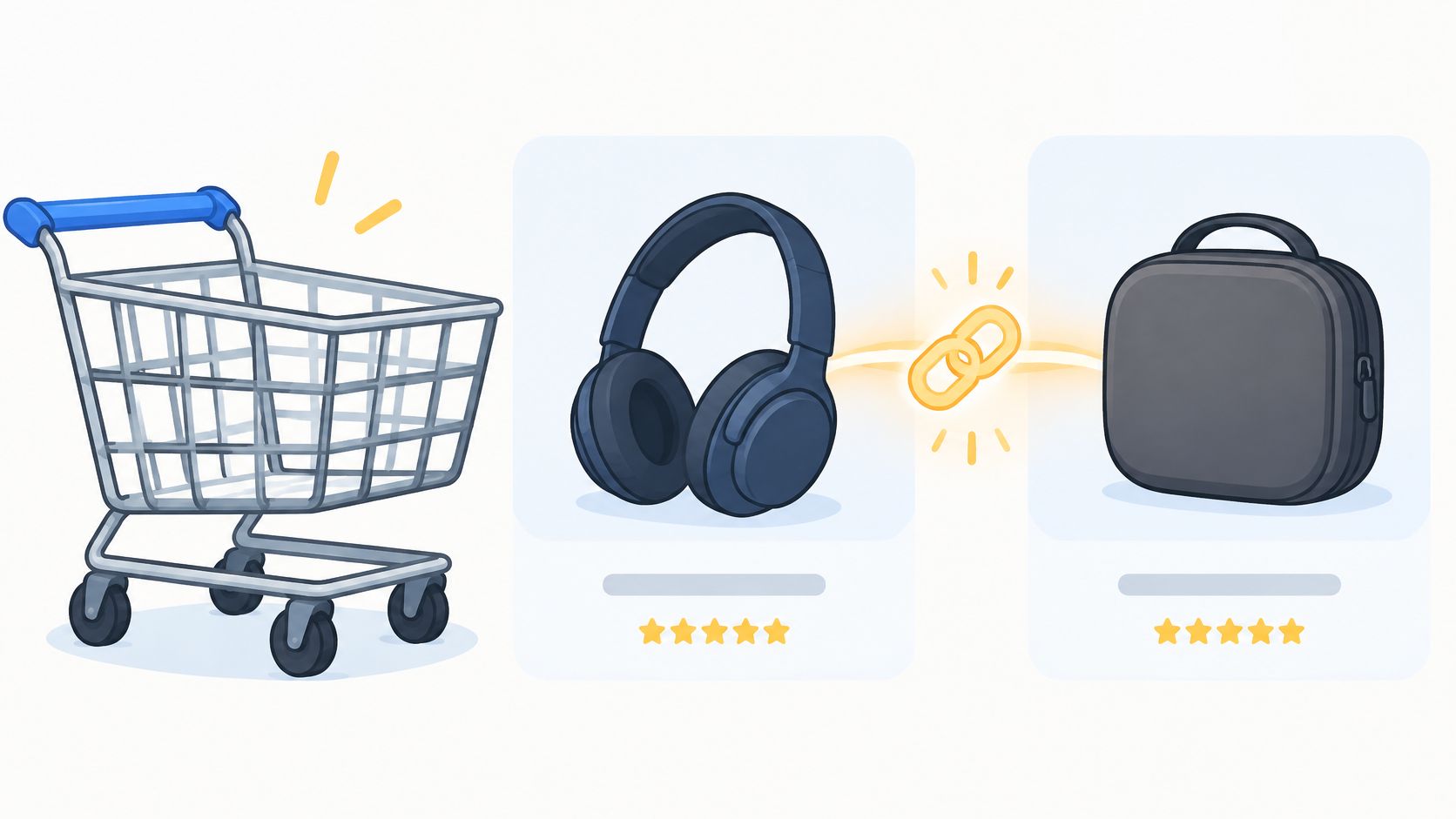
The cart is a poor place for discovery and a good place for a decision. Someone who has already committed to an item will add the consumable that goes with it, the warranty, or the travel case. They won't start browsing a new category, and pushing one at that moment sends them backwards into research mode.
Shopify's free Search & Discovery app gives you the plumbing: create complementary product recommendations as metafields, then add the recommendation block to the cart template. No app subscription, no third-party script on a page that has to stay fast.
Rules that keep it from backfiring
- Two or three items, maximum: a carousel of six is a second storefront, and it competes with the checkout button.
- Complementary, not pricier: "goes with" converts. "Upgrade to the expensive one" invites a shopper to leave and compare.
- Filter hard: exclude anything already in the cart, sold-out variants, and products that ship from a different region on a long lead time.
- One labelled slot: a single block titled "Add to your order" beats three modules with no hierarchy.
The failure mode is a shopper who was already hesitating. Adding a decision at the last step pushes an undecided visitor back into browsing rather than forward into payment, and the lost order costs more than the add-on earns. If you want the product-selection logic in more depth, this piece on how to cross-sell on Shopify covers matching rules and placement.
5. Transparent Shipping, Tax, and Discount Preview
A shopper sees a $68 cart, reaches checkout, and finds $11 of shipping and $9 of tax. The order dies there, and it dies for a reason you controlled. Baymard's cart abandonment research puts 40% of US shoppers citing extra costs as the leading actionable reason they abandon, with slow delivery at 20%. Both are cart-page messages, not checkout surprises.
Build the cart so the total is honest before payment. Configure your rates under Settings, Shipping and delivery so the cart estimate matches the checkout rate for the same destination, then label estimates as estimates ("Estimated shipping", "Taxes calculated at checkout"). Show cart-level discount codes as their own line item rather than reducing the subtotal without notice, so the shopper can see the code worked.
Displaying an estimate you can't honour at checkout is worse than displaying none. A wrong number teaches the shopper that your totals move.
The failure mode is a shipping estimator form dropped onto the cart. For domestic stores with flat rates it adds friction and no information. For international stores selling into multiple zones it often returns a number your checkout then contradicts, because the calculator app and Shopify's shipping profiles disagree. Test a full estimator only where landed cost varies by destination, and keep it collapsed until the shopper asks.
6. Guest Checkout and Trust Signals Near the Checkout Button
Start with one admin setting, because it's the cheapest fix on this list. In Shopify, go to Settings, then Customer accounts, and set accounts to optional rather than required. Account creation can be offered after the order instead, through a passwordless login link on the Thank you page, which converts far better than a password field in front of an impatient buyer.
The field count explains why. In 2024 the average e-commerce checkout contained 11.3 form fields across 5.1 steps, per Baymard Institute's checkout usability research as compiled by Statistics Global. An account screen sits on top of that, adding a password, a confirmation, and a validation error waiting to happen.
Trust signals, kept minimal
- Two elements, not ten: a returns policy link and accepted payment icons under the total do the job. A wall of badges reads as a scam.
- Nothing stale: a "30-day free returns" line left up after the policy changed is a chargeback waiting to happen. Review quarterly.
- Placement over volume: signals belong beside the button the shopper is about to press, not in the footer.
The failure mode is decoration replacing policy. A padlock graphic reassures nobody who has already decided you look untrustworthy; a plain sentence about who pays return shipping does. Measure new versus returning customers separately, since trust messaging moves first-time buyers and barely touches repeat ones.
7. A Simplified Cart Layout With a Sticky Mobile Checkout Button
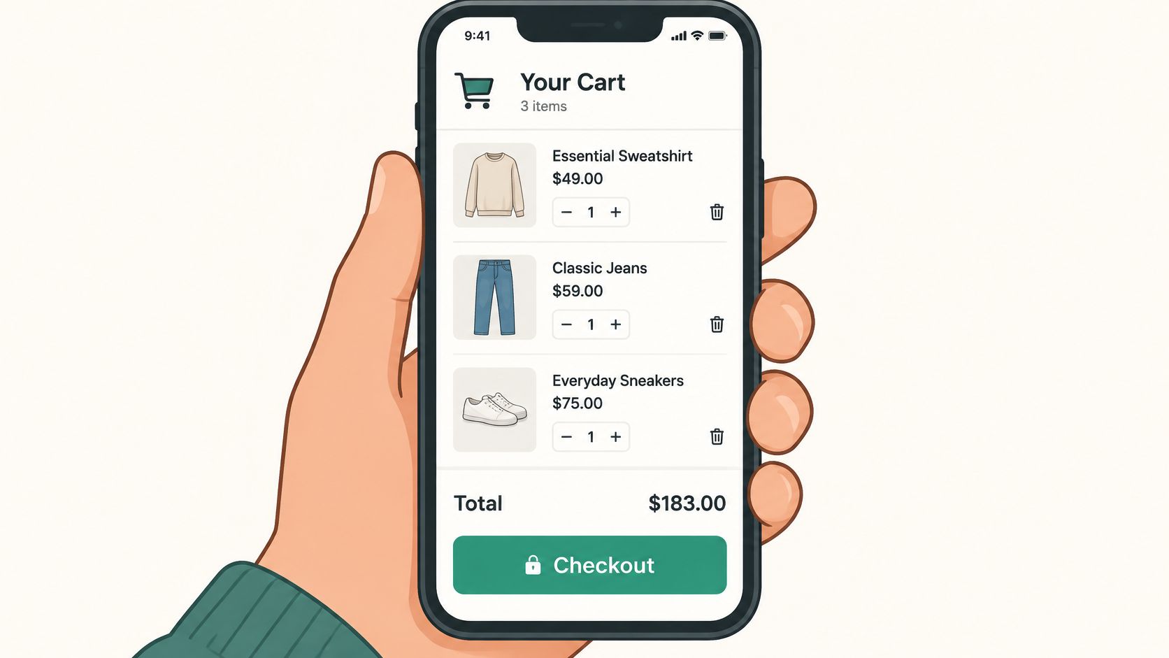
Most Shopify cart pages are fine on a 27-inch monitor and hostile on a phone. The checkout button scrolls away, quantity steppers are thumb-sized for a child, and the total is somewhere above the fold that no longer exists. Layout work fixes that faster than any app.
The scale of the problem is worth keeping in view. Baymard Institute research cited in Shopify's 2023 partner feature roundup found 65% of sites deliver a checkout experience rated mediocre or worse, while only 2% achieve a good rating. The cart is the on-ramp to that experience.
Implementation details that matter
- Sticky bottom bar:
position: stickyon a bar containing the total and the checkout button, with matchingpadding-bottomon the item list so nothing hides behind it. - Safe area handling: add
padding-bottom: env(safe-area-inset-bottom)or iOS Safari's toolbar will eat the button. - Touch targets at 44px: quantity buttons and remove links included, not just the primary CTA.
- One primary action: two identical checkout buttons on one screen splits attention and analytics.
If the sticky bar covers the discount field, you've traded a checkout for a support ticket. Test it on a small iPhone and a tall Android before you ship it.
Judge it on mobile cart-page exit rate and checkout-started rate by device, not on how the mockup looks in Figma.
7 Cart Page Tactics at a Glance
| Primary Goal | Effort to Implement | Best For | Main Risk |
|---|---|---|---|
| Let shoppers review and edit their cart without leaving the current page | Low if supported by the theme; otherwise requires customization | Mobile shoppers and stores seeking a shorter path to checkout | Can feel intrusive on small screens or conflict with third-party apps |
| Encourage shoppers to add items to reach a free-shipping threshold | Moderate; requires threshold logic and ongoing updates | Stores with sustainable free-shipping thresholds and add-ons that can close the gap | A poorly chosen threshold can hurt margins or discourage shoppers |
| Let shoppers pay quickly using saved digital wallet details | Low to moderate; depends on payment setup and theme support | Mobile shoppers and repeat customers who use digital wallets | Wallet availability varies, and buttons can obscure the standard checkout path |
| Increase cart value with relevant complementary product recommendations | Moderate; requires recommendation logic and merchandising review | Stores with useful accessories, bundles, or add-ons | Irrelevant or excessive recommendations can clutter the cart and reduce trust |
| Show estimated shipping, taxes, discounts, and total costs before checkout | Moderate; requires accurate shipping rules and cost estimates | International shoppers and customers sensitive to unexpected costs | Estimates may differ from final checkout totals |
| Reduce checkout hesitation with guest checkout and nearby trust signals | Low; often involves settings and small content changes | Stores where account creation or trust concerns may deter checkout | Excessive or outdated trust messaging can clutter the page or undermine confidence |
| Simplify cart use and keep checkout accessible on mobile | Low to moderate; depends on theme support and device testing | Mobile-first stores with long or scroll-heavy carts | A sticky bar may cover content or hide useful cart information |
Start With One Change, Then Test Your Way Up
You don't need to rebuild your cart to move the number. Pick the tactic that addresses your largest measured leak, ship it behind a test, and read checkout-started rate before you stack the next change on top. Stores that fail at this usually fail in the same way: they redesign the cart, launch five changes in one week, see a lift, and can't say which change earned it. That makes the next decision a guess.
Sequence beats volume. Fix cost transparency first if your abandonment is concentrated at the shipping step. Fix the drawer and layout first if people add to cart on mobile and never reach checkout. Fix express buttons first if you sell to repeat buyers who already have a wallet saved. Each of those points at a different diagnostic: cart-to-checkout rate, checkout completion rate, device-level abandonment, and revenue per session. Instrument all four before you touch a template, then let the weakest one pick your first project.
The compounding part is unglamorous. A drawer that opens cleanly, a bar that tells the truth about discounts, an express button that works on an old Android phone, a trust line that's still accurate in six months. None of those is a redesign, and together they're usually worth more than one.
If you'd rather hand the audit and the testing to a team that does this weekly, ECORN runs Shopify CRO audits, A/B testing, and monthly Shopify packages with an hourly single-project option, as an official Shopify Partner Agency that has supported more than 100 brands. Start with one cart change this week.
A drawer, a progress bar, and a working express checkout are small changes individually, but they sit on the highest-intent page in your store. ECORN builds and optimizes Shopify storefronts with a CRO audit, A/B testing, and development in the same scope, so the cart fixes get shipped rather than added to a backlog. If you want an audit of where your cart leaks revenue and a prioritized plan to fix it, visit ECORN and start a conversation.


Shopify Post Purchase Upsell: Setup, Timing and Results

Ab Test Sample Size

Shopify Social Proof: 7 Apps That Build Buyer Trust

10 Best Shopify Design App Tools for 2026: Pros and Cons
Shopify Local Development: Setup, Workflow and Fixes

Shopify Theme Minimal: How to Design and Build One
Consistent Website Design: A Practical Guide for Stores

Shopify Development Company in USA Hiring Guide
Shopify Inventory Tracking App: How to Set It Up Right
Shopify Volume Pricing: How to Set Up Tiered Discounts
How Does Shopify Work for Sellers? a Practical Guide
Shopify Theme ZIP: How to Upload and Install It
Shopify Plus Organization Admin: Roles and Access Guide
How to Build a Drop Down Menu in Shopify: Steps and Fixes
Shopify Plus Integration Services Guide
Shopify Customer Experience: A 2026 Guide

AI Lead Generation for E-commerce Growth
Shopify Plus Expansion Stores: Limits and Setup
Shopify Theme Update: Safe Steps, Backups and Rollback
Shopify Website Design Packages: What You Actually Get

How to Choose a Shopify Plus Web Design Agency in 2026
Shopify Plus Ecommerce Agency: How to Pick the Right One
Shopify Themes Retina: How to Serve 2x Images

How to Cross Sell on Shopify Without Friction

Best Shopify Theme for Custom Products Compared
Multi Store Inventory Management: A Practical Guide

SEO Consulting for Ecommerce: A Practical Guide

Shopify Theme Updater App: A Safe Update Playbook
Shopify Git Integration: A Developer's Guide to 2026
Headless Ecommerce Development Services Explained

How to Build a Shopify Clothing Website That Converts

How to Launch a Box Subscription Business in 2026

Luxury Skincare Branding Playbook That Converters
11 Best Podcast Ecommerce Shows for Store Growth in 2026
Shopify Developer Hourly Rate: What to Pay in 2026
Critical Shopify Setup Errors That Are Secretly Sabotaging Your Store
Ecommerce Conversion Tracking: The Complete How-To Guide
Shopify Design Agency: How to Pick the Right Partner
Mastering Multi Store Management on Shopify

Scale Shopify Store
10 Shopify App Ideas Worth Building in 2026
Conversion Rate Optimization for Landing Pages: The Playbook
Shopify Plus Automation: A Guide for 2026
10 Social Selling Platforms for Shopify Merchants

Shopify Website Design Examples: 7 Stores Worth Studying
7 Ecommerce Newsletter Examples for Shopify Brands
One Product Shopify Store: Build and Scale
Mobile Pop Up Strategy for Shopify Stores That Converts
Sitemap for Shopify: How to Find, Optimize, and Submit It

7 Single Product Websites Worth Emulating
Product Variants Shopify: The Complete 2026 Guide
Ecommerce Analytics Consulting for Growth

What Is AI Integration for eCommerce
How to Choose the Right eCommerce Website Development Firm
E Business Strategy Implementation
Conversion Tracking Setup for Shopify Stores
BigCommerce vs Shopify Plus Which Enterprise Wins in 2026
Shopify Theme Kit: Setup, Commands, and Migration Guide

Shopify Extension Development: A Practical 2026 Guide
Shopify Speed Score Explained and How to Improve It
Shopify Mobile Optimization: The 2026 Playbook
How to Add Subcategory in Shopify for Better UX
How to Implement Structured Data for Ecommerce in 2026

SEO App Mobile: Shopify Store Optimization Guide
Shopify Plus Support: What It Includes and How to Choose

Google Ads for Shopify: The Complete 2026 Playbook

Shopify New York: How to Find and Hire the Right Agency
Google Search Console for Shopify: The Complete Setup
First Party Data Collection for eCommerce Growth
FAQ Online Store Guide: Build and Measure It Right
Do FB Ads Work for eCommerce in 2026?
One Page Checkout for Shopify: Design and Implementation
Shopify GraphQL vs REST: The 2026 Developer Decision
Shopify Ecommerce Consulting: Strategy, Pricing &

Are Reddit Ads Worth It for eCommerce Brands

Shopify Title and Meta Description: A Practical 2026 Guide

Product Video Best Practices for Shopify Brands
Real-Time Inventory Management: A 2026 Guide

AI Chatbot Integration for Shopify Stores
Affiliate Program Management: A Shopify Guide
10 Best Performance Monitoring Tools for Shopify in 2026

Digital Asset Management for eCommerce Brands in 2026
Every Type of Facebook Ads Explained for eCommerce Growth
Product Information Management Explained for Shopify Brands
Support Ticket System: A Guide for Shopify Stores

10 Best Customer Service Tools for Shopify in 2026

Can I Start a Business with No Money? a 2026 Blueprint

What Sells Good on Etsy: Best Niches for 2026

Shopify Add to Cart Button: A Practical 2026 Guide

Customer Feedback Automation: A Practical eCommerce Guide
Critical Rendering Path: A Guide for Shopify Stores

How to Promote on TikTok for eCommerce in 2026

B2B eCommerce Consulting That Drives Real Revenue

10 Best Practices for Site Navigation in 2026
Return vs Refund for Shopify Stores: A Practical Guide
What Is Customer Lifetime Value and Why It Matters
What Is Voice of Customer Research for eCommerce

SMS Marketing for Ecommerce That Actually Converts

Master How to Improve Email Deliverability in 2026

Top 8 eCommerce Partners NYC for Shopify Brands in 2026


newsletter in your inbox